June 25, 2020
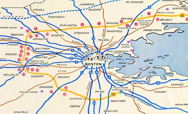
This 1959 map of Route 128--dubbed the "golden semicircle"--is an example of how maps seek to influence our perception of reality.
“Bending Lines,” the latest project created by the Boston Public Library’s Leventhal Map and Education Center, explores the ways maps can affect and sometimes distort how we perceive reality. While maps tell us a lot about what the world looks like, they can also subliminally, and sometimes explicitly, sway viewers toward the mapmaker’s perspective.
Garrett Nelson, a curator of the exhibit, said examining how maps have historically distorted reality is at the heart of the project. “The organizing theme of this exhibition is to think about how maps produce a sense of truth and trust and belief – so, how we come to know things about the world through maps,” said Nelson.
“The thinking behind it is not that there are some maps that are accurate and some maps that are deceptive, but rather that all maps simplify the world in different ways, and paying attention to who’s doing that representation and simplification is really important in order to construct a critically informed trust in maps.”
The digital exhibition draws on The Leventhal Center’s extensive collection of historical maps to show readers how the Boston and New England regions have been portrayed over the years, starting with a 1635 map of the region produced by explorer John Smith.
His map disingenuously paints the area as naturally abundant with “Gardens and Corne fields,” praises it as “a most excellent place, both for health & fertility,” and erases any presence of the indigenous Massachusett people in an effort to persuade the English to move to a better, newer version of their homeland.
Nelson said the 17th century document is an example of how maps “[emphasize] certain things that people want to see at different moments.”
A later map from the 20th century, published in a 1959 edition of Boston Business Magazine, at right, depicts the nascent Route 128 as a “golden semicircle” around Boston, refocusing the suburbs at a time when many white Bostonians were fleeing the city.
“It marketed this very different pattern of suburban development in the postwar era,” explained Nelson. “That map is an example of what gets emphasized and what gets de-emphasized. The 128 corridor is literally golden, and the city of Boston is this little figure in the center that the suburbs have access to.”
“In some ways it’s kind of a humdrum map; it was published in a business magazine, it’s just kind of marketing the geography of business opportunities, but the way that it privileges a certain part of Massachusetts geography at the expense of another is of course part of that process of using maps to kind of put a spin on things,” said Nelson.
For a section of the exhibition titled “Same Data, Different Stories,” the map center commissioned five teams of cartographers to make two competing maps based on the same set of data. One pair, created by Malden-based cartographer Andy Woodruff, alternatively depicts Boston as a transportation mecca and a transit desert. One map borrows language art styles from the 19th century’s golden age of transportation to extol the MBTA’s “64 miles of subway and light railway, 555 miles of commuter railway, and 6,195 miles of omnibus routes.” The other map makes the opposite argument, dubbing Greater Boston “The Great Transit Desert” and highlighting swathes of Dorchester and Roxbury that lack easy access to mass transit.
“These are the same data set, but the visual language is so different and the labeling is different,” said Nelson. “What we’re trying to show here is that the data themselves don’t make the argument; it’s how the cartographer chooses to represent and analyze that data.”
“Bending Lines” is currently available in a digital, interactive format at leventhalmap.org due to the pandemic.